Home should be your happy place, but with the right paint color, it can also be your clean, sophisticated, passionate, zen, comfortable or creative place. Whether you’re building a new home or remodeling your current space, the paint colors you select not only influence the style of your home, but your frame of mind as well. So next time you’re pondering over color samples, you may want to consider, “How do I want to FEEL when I enter this room?” See below for a list of colors—and the moods they evoke—from the experts at Pratt & Lambert Paints. Plus, get our recommendations for how to best leverage each color to match the desired ambiance of various living spaces.
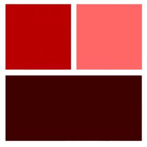 |
RED – Excitement, passion, tenacity. By far the most vibrant and impactful color, red can make a wall pop like no other. Use caution and thoughtfulness when you make the bold decision to go red. We recommend red for accent walls if a room needs more energy, specifically for an exercise room, game room or bedroom. |
 |
ORANGE – Happy, warmth, attitude. Orange, when mixed bright or subdued, brings positivity no matter how it’s applied. From peach to rust, orange creates flare in areas of the home you want to feel the happiest such as a kitchen, playroom or family room. |
 |
YELLOW – Sunny, optimistic, creative. Like a breath of fresh air, yellow can bring a wave of joy through your home. Feel the love for yellow in nurseries, community spaces or creative spaces such as a kitchen or a hobby room. |
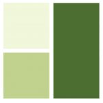 |
GREEN – Growth, harmony, comfort. You don’t need a green thumb and a sunny sill to cultivate more green into your home. From glowing lime to deep emerald, green wall colors can bring fresh feelings to full bloom. We recommend going green in a sunroom, bathroom or exercise space. |
 |
BLUE – Dependability, loyalty, calm. “Feeling blue” is an expression for reason. Cool, icy hues of blue can certainly subdue the mood. Use blue for places you intend to relax—bathrooms, bedrooms, reading nooks and lounges. |
 |
PURPLE – Sophistication, mystery, wisdom. This powerful color makes a strong impression and should be used with careful consideration. Deep violets to frosty lavenders work best in spaces meant to channel your luxurious or sophisticated side such as a cocktail lounge, library, office or spare bedroom. |
 |
WHITE – Purity, cleanliness, neutrality. There’s no doubt about it—nothing conveys clean more than a pristine white surface. And who doesn’t want to feel clean in every room of their home? That’s why white (and it’s beige variations) are the most popular colors for every room of the home. White works especially well in places where feeling clean is important including a laundry room, bathroom and kitchen. |
 |
GRAY – Balanced, solid, strong. There’s a reason cool, sensible gray has been so hot for years. Summoning feelings of balance and reliability, grays are a natural palette for the entire home much like other neutrals. |
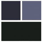 |
BLACK – Authority, power, stability. Black is back! A little goes a long way with this impactful color making it great for trim, accent walls and fine details. We recommend conjuring up feelings of strength in an office, bar or subtly in main living spaces. |
2017 Color Trends
Trying to decide which shade of a certain color is best? Start with what’s trending now. From jewel tones to earthy bolds, deep rich colors are expected to gain popularity this year. Get Pratt & Lambert Paints 2017 Color Forecast.
Need More Color Consultation?
Stop at Van’s Lumber in Dyckesville to talk with our experts, browse Pratt & Lambert Paints options and purchase your favorite to get started on your next project.